Introduction
CEB Care is a mobile app developed by the Ceylon Electricity Board (CEB), Sri Lanka’s primary electricity provider. The app offers customers an easy and efficient way to manage their electricity services such as lodging complaints, bill payments, and view power interruptions.
Problem & Solution
User Research
To better understand the requirements and challenges of the potential users, I conducted a detailed analysis of user reviews for the CEB Care app posted on the Google Play Store. This research provided valuable insights from users' experiences and feedback, helping me identify problem areas to enhance the overall app experience.
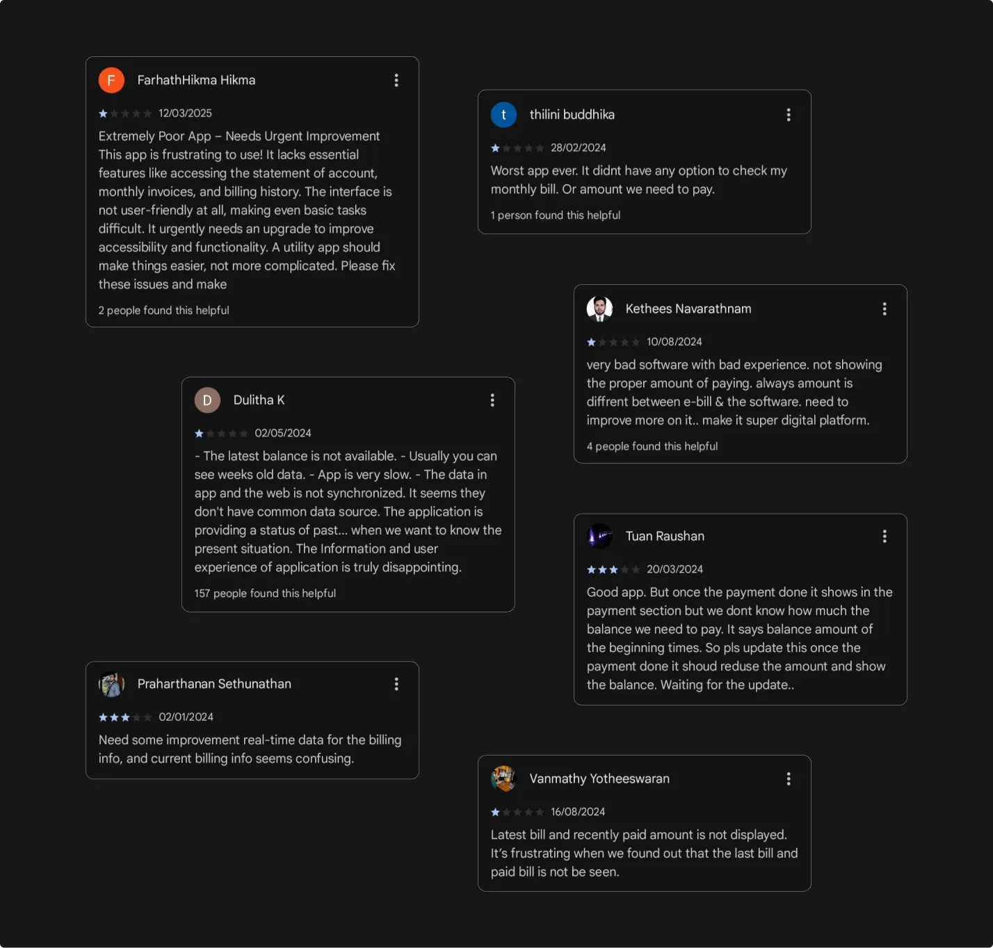
While researching the problem areas of the CEB Care app, I identified critical issues that affect the user experience and effectiveness of the functionality.
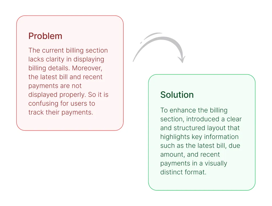
- The current billing section lacks clarity in displaying billing details.
- The latest bill and recent payments are not displayed properly. So it is confusing for users to track their payments.
Existing Solution Blueprint
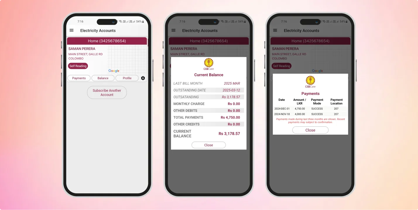
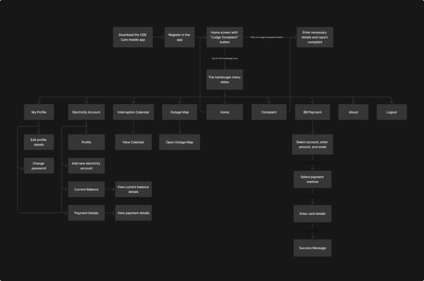
I drafted an existing solution blueprint for the CEB Care application. It is essential to analyze the current system architecture and identify its functionality, user interface, and overall user experience. This blueprint provides a clear, and structured overview of the current state of the app's key features.
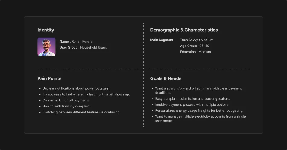
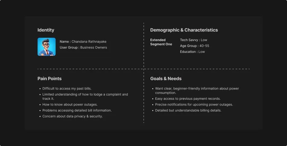
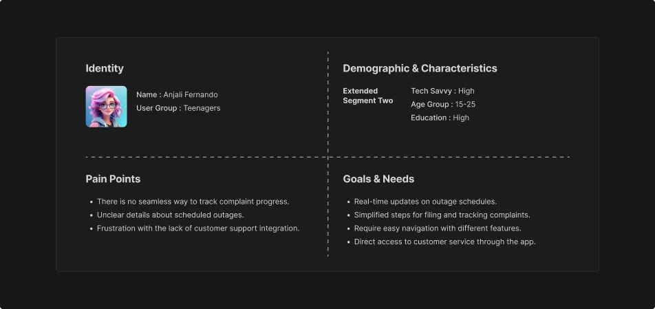
Persona
Mainly I segmented our personas into three segments. These personas provide a deep understanding of the specific pain points, goals, and needs of each user groups. So, it helps me to tailor our design solutions more effectively to improve their interaction with the CEB Care app.
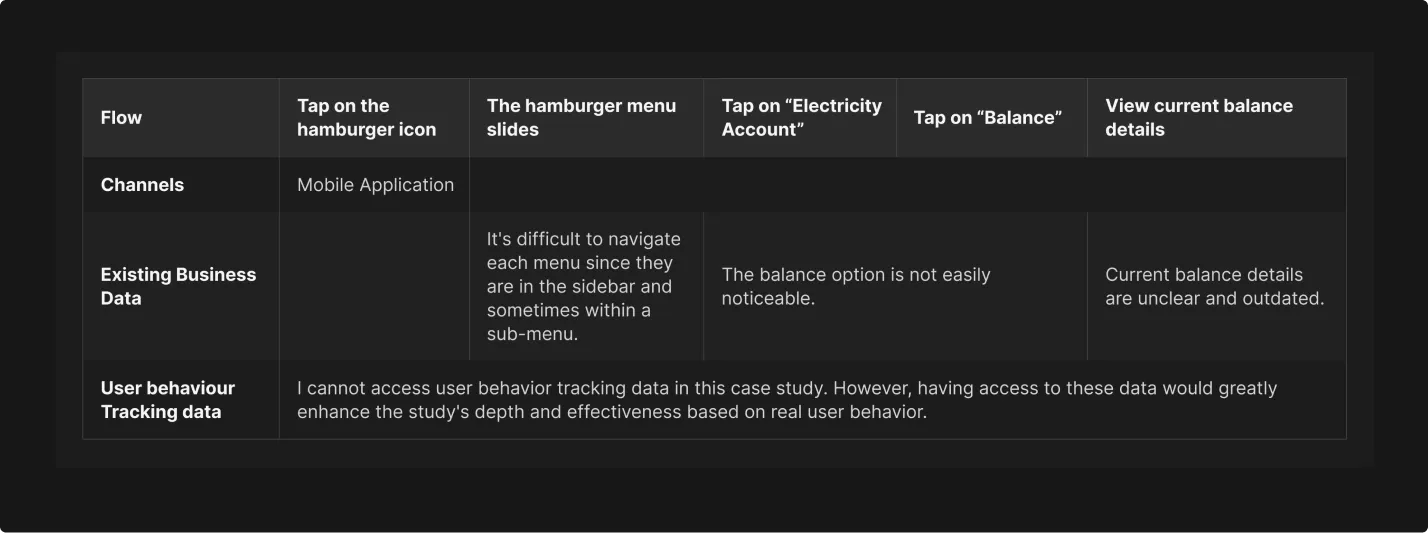
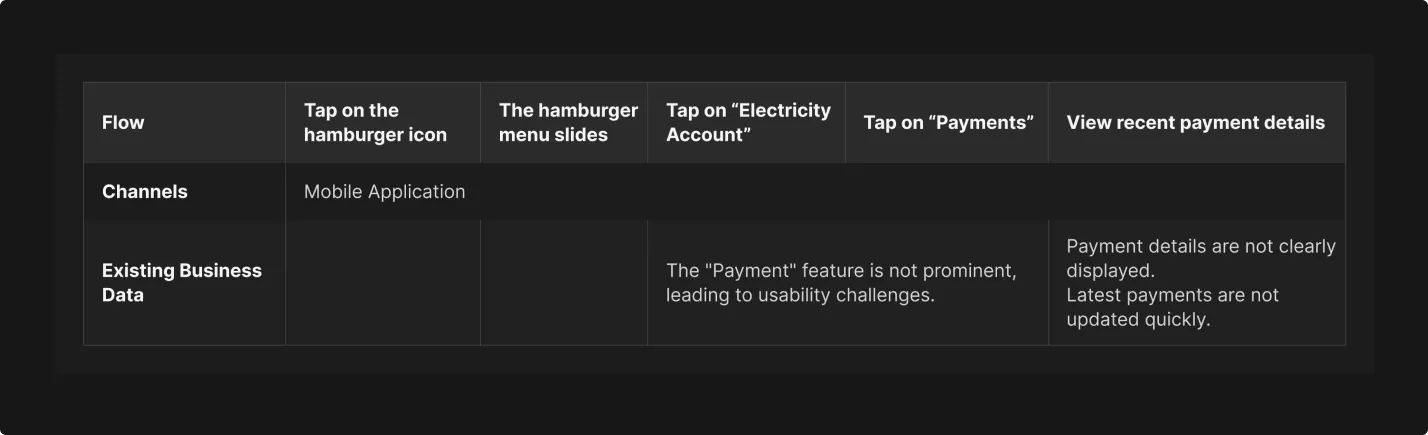
User Experince Matrix
Here, I created the User Experience Matrix by analyzing the user journeys of the existing solution blueprint. This UX Matrix gives me a deeper understanding of key features to be improved with our design solution.
- User journey: View billing details
- User journey: View recent payment details
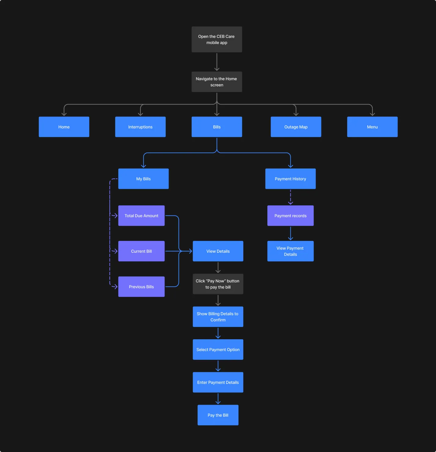
Proposed Updates
After analyzing all the necessary information, user’s pain points, and feedback from CEB Care users, I crafted a fresh solution blueprint for the CEB Care app.
Solution
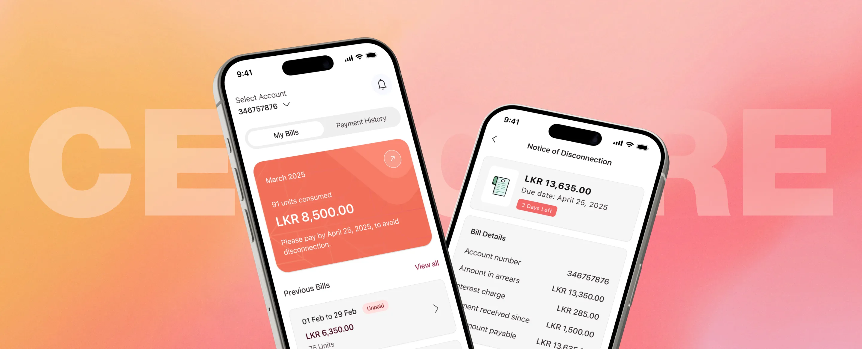
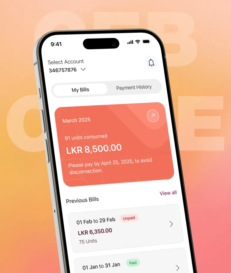
Here are the proposed solutions outlined in my case study. The redesign simplifies navigation, making it easier for users to monitor their payments, understand billing details, and avoid missed deadlines, leading to a more seamless and stress-free bill management experience.
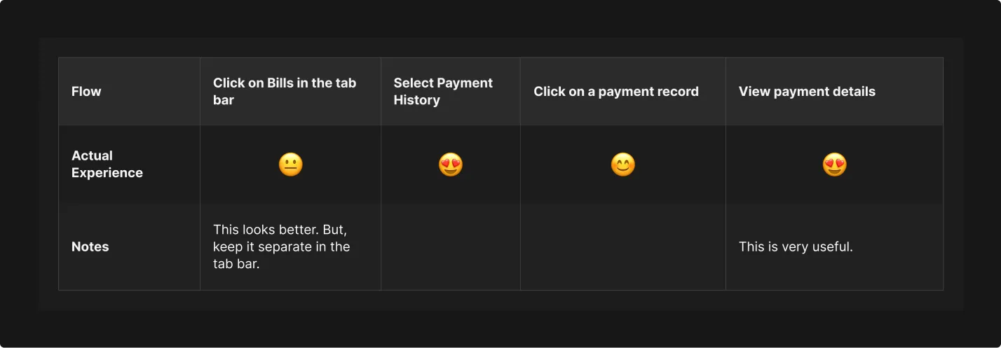
Solution Test
After introducing a new solution for the CEB Care app, I conducted testing with users aligned with previously defined personas. Here are the results of the collected data.
- User journey: View billing details
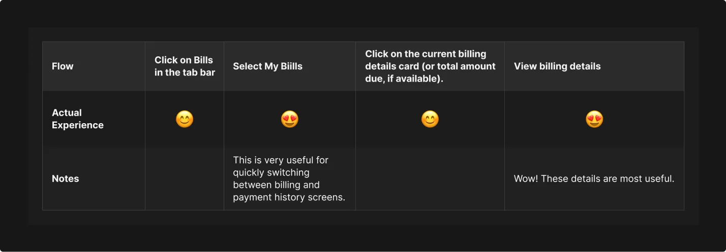
- User journey: View recent payment details
Conclusion
The CEB Care app serves as a critical digital touchpoint between the Ceylon Electricity Board and its customers, offering a convenient platform to manage electricity-related services. Such as submitting complaints, viewing billing details, paying bills, and checking payment history. It also lets users get real-time updates through the interruptions calendar directly through the app.
This case study analyzed the current state of the CEB Care app, highlighting its strengths and opportunities for Improvement.
Strengths
- Comprehensive Service Access: Users can pay bills, view payment history, and stay informed about power interruptions in one platform.
- Complaint Handling: Easy reporting of power outages or breakdowns improves customer service.
Opportunities for Improvement
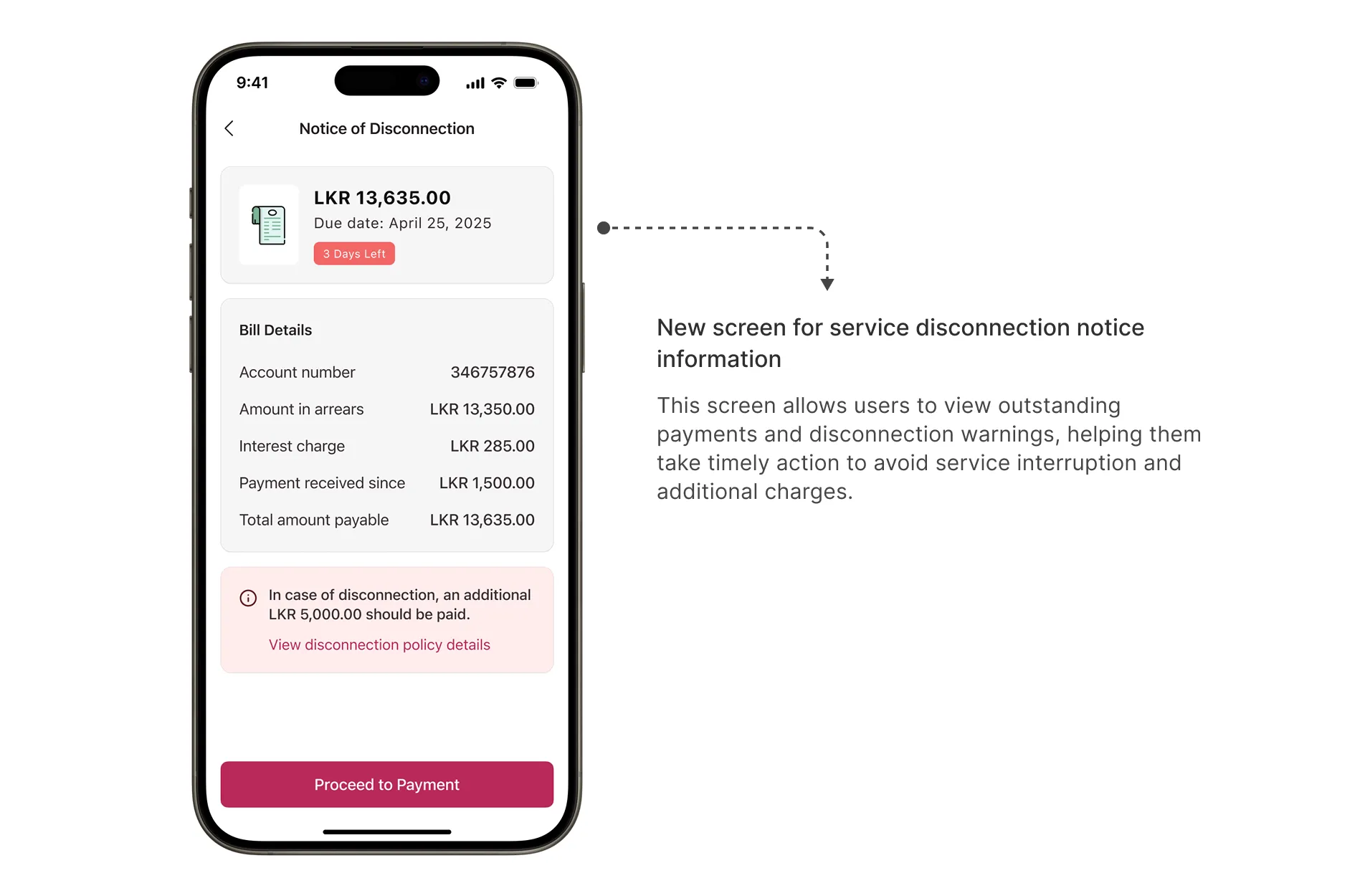
- Confusing Billing Information: The previous billing section wasn't user-friendly. Key details like the current due amount and the recent bills weren't clearly presented, which made it hard for users to understand what they owed.
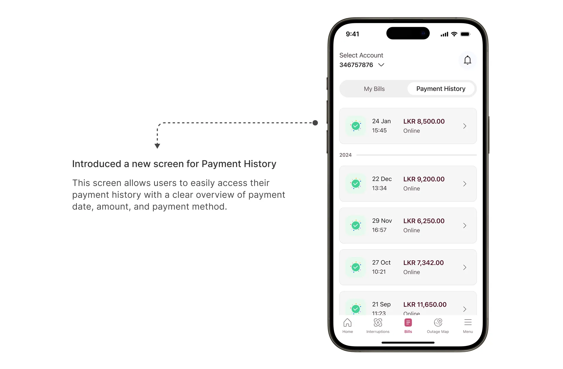
- Unclear Payment History: Payment history wasn’t clearly visible, which caused confusion and made it harder to keep track of payments.
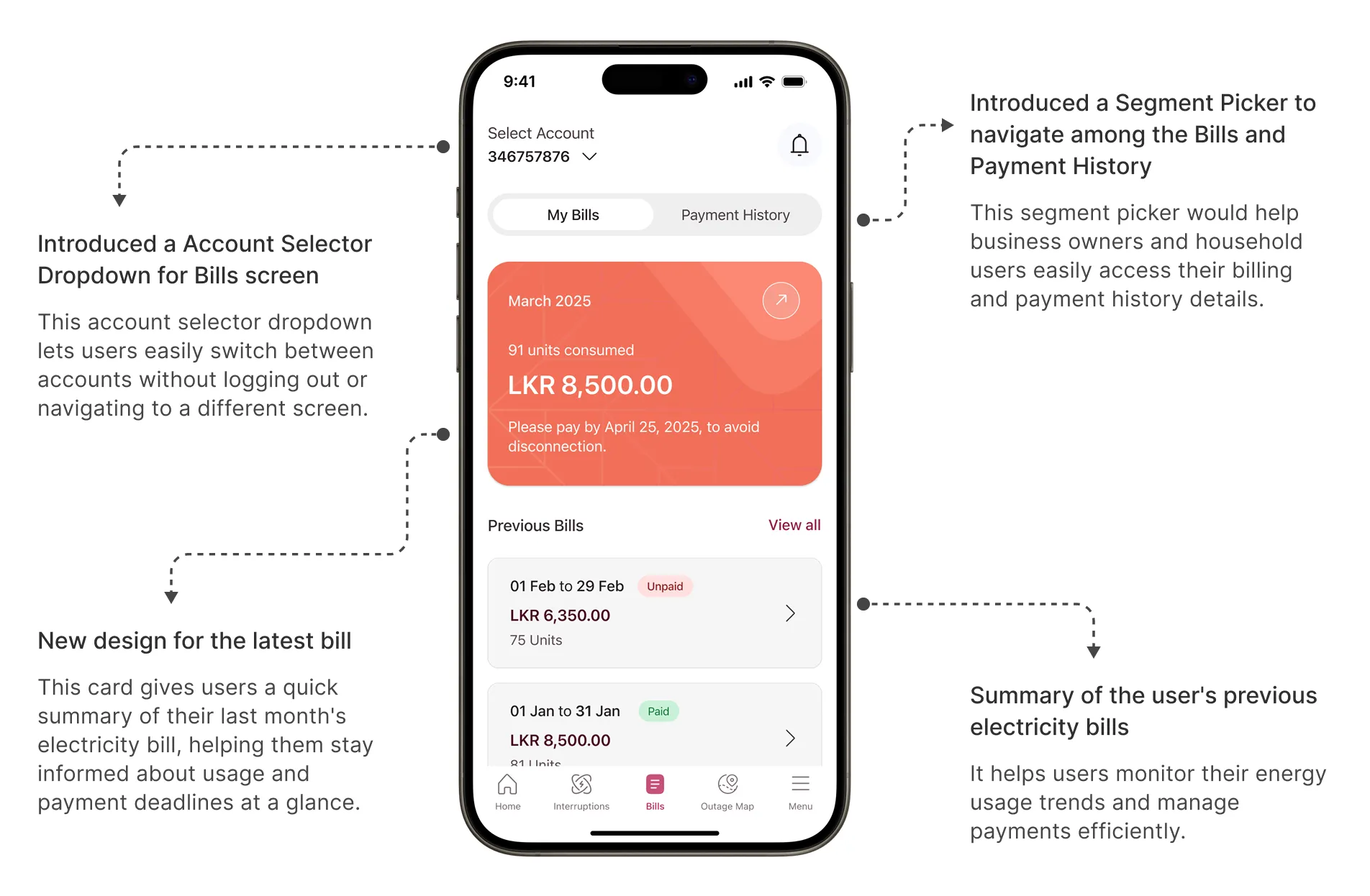
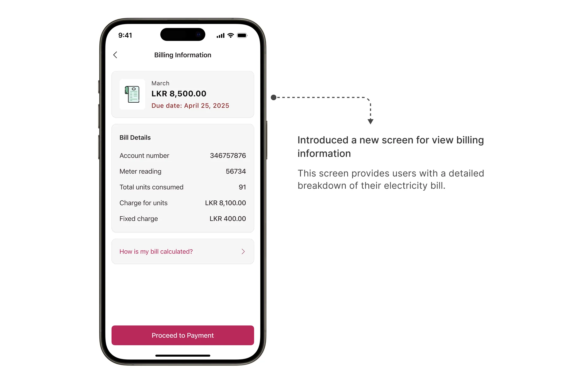
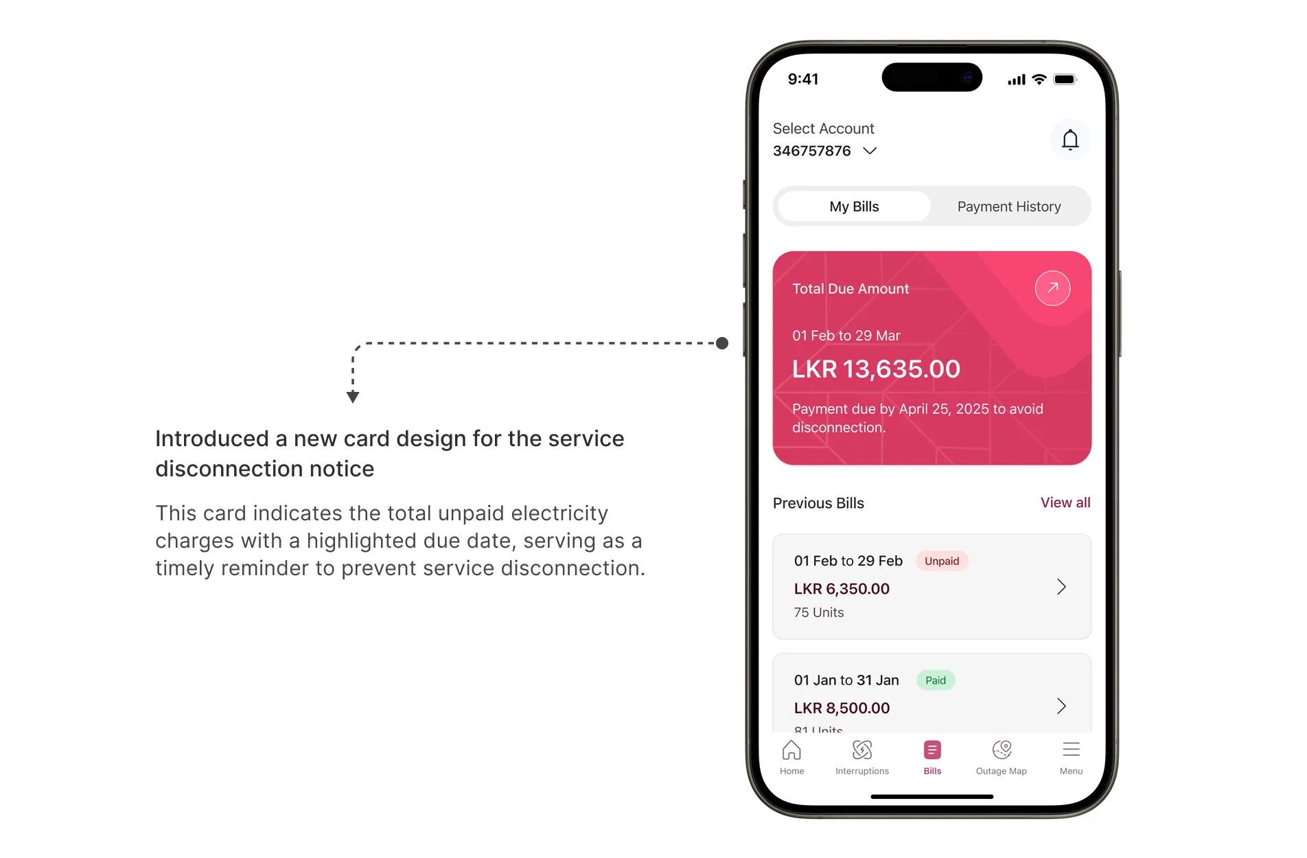
Proposed Solutions
- Simplified Billing Section:Introduced a clean and structured layout that highlights total due amount, latest bill, and recent bills in a visually distinct format.
- Disconnection Notice:To help users avoid service disconnection, a prominent banner is displayed with a clear disconnection notice when there is an overdue payment.
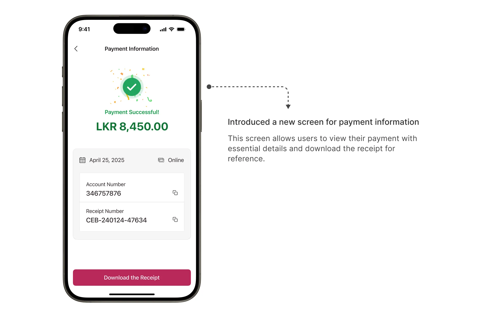
- Improved Payment History:Users can now easily scroll through their entire payment history with a clear layout, view full payment details, and download receipts for future reference.
By solving these key issues, the redesigned CEB Care app now delivers a simpler, more intuitive, and user-friendly experience. Users can quickly view and pay bills, track their payment history, and stay informed about due dates, which improves trust and overall engagement with the app.
What I Learned
This project taught me how to think more critically and creatively as a UX designer. From research to redesign, I gained hands-on experience in applying the design process to solve real user problems in a structured, meaningful way.
One of the most important takeaways was the value of a user-centered mindset. By prioritizing user needs and pain points, I learned how to identify friction points in the user journey and translate those insights into clear, actionable design improvements.
This project helped me grow in areas like:
- Thinking systematically about problems instead of jumping to solutions.
- Trusting the process and iterating with intention.
- Communicating design ideas clearly through visuals and storytelling.
Most importantly, this project reminded me that great UX isn’t simply about designing something beautiful. It’s about designing something meaningful.